Today I’m going to show you how incredibly powerful post-processing is and why you’d be a raving-mad hatter not to consider post-processing your favorite photos. Post processing is a skill that no traveller with a camera should be without because it has the potential to completely change the language of your photography; especially if you leverage “selective color”, but we’ll get to that.
So what’s the difference between a photo that’s post-processed and one that isn’t?
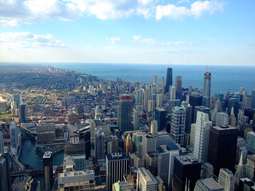 Well, a few months ago when reviewing inbound links, I noticed that this particular photo was getting 10x more attention than any other photo from my Sears Tower photo shoot.
I hadn’t seen it in years and realized that, knowing what I know now, I could post-process this photo much better than the minimal processing I did when I first published it in late 2008. In fact, it was kind of embarrassing to see just how bad the original photo was, and over a thousand people had already seen it this way! The photo just wasn’t living up to its potential, and I knew I needed to change that.
If you aren’t familiar with the concept of post-processing, it is the process of intelligently improving a photo after it is taken (rather than making adjustments in the camera as you take the photo) so that it becomes a more compelling and effective image. The post-processing technique I’m going to share which you today has evolved over many years of trial and error, but it can summarized into three main steps which I’ve outlined below. To follow these steps, you’ll need a photo editing app such as iPhoto or Picasa. I also address how to utilize more complex applications (such as Photoshop) in step 3, but rest assured the concepts in step 3 can be applied to simpler applications, as well.
Let’s begin!
The 3 Steps to Greatness
- Crop with precision
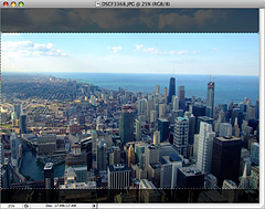 Cropping is always the first thing I consider when post processing a photo. Sometimes a crop won’t be necessary, but often a carefully done crop can make or break an image’s composition. In fact, this is an extremely important step because how you frame an image has everything to do with how the image’s content is presented.
- Try different ratios. Most photos are shot in 4×3 today. Try 3×2. Sometimes I even use 5×3. Most photo editing programs will allow you to set different crop ratios and make it easy to see how a given crop will change the composition even before you apply the crop. (If you aren’t sure what a ratio is, it’s the width of a shape divided by the height.)
- Be sure to leave some negative space around your main subject. If you don’t, it will result in a photo that feels crowded.
- Also remember to crop out unnecessarily elements if they distract from your main subject or subjects. If you don’t, you’ll end up with a cluttered image that doesn’t draw the viewer in. But if you crop intelligently, you can create a composition that gracefully leads the eye around your photo.
- Fine-Tune the Brightness Curve
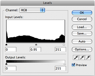 Also known as “adjusting the levels”, fine-tuning the brightness curve of your image is essential. In most apps, the levels will be represented as a histogram which looks like a black mountain range.
 - You may see the black mountain shape disappear before it gets to the edge of one side of the box. This means either the whites aren’t as bright or the darks aren’t as dark as they could be. In iPhoto you can click “Edit” and then “Adjust” to bring up a panel that allows you to control the levels. In Photoshop, choose the “Layer” menu > “New Adjustment Layer” > “Levels” to bring up the levels control.
- Below this black mountain shape (which represents the brightness curve on the image) are three triangles which control the black, grey, and white levels of the image. Try moving them and seeing how the image changes. To adequately discuss levels would require an article of its own, but just keep in mind that as long as you’re using an adjustment layer in Photoshop, or adjusting the image in iPhoto, you can always change these later without hurting the image.
- Color Correct (preferably using Selective Color)
 If you’re using a lighter photo editing app (like iPhoto) and then finishing up in a more complex program like Photoshop, you may want to do a few slight tweaks before you bring the photo into the final app. This isn’t strictly necessary, but it worked out that I adjusted the photo’s temperature balance by 4.1% in iPhoto before bringing it into Photoshop. You can do this in Photoshop, as well; but since I was post-processing dozens of images and not all deserve Photoshop treatment, I sometimes bring images into Photoshop that have already been slightly color-corrected by iPhoto.
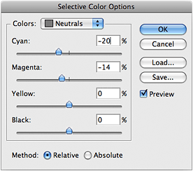
 Ever since I discovered “Selective Color” controls, I spend most of my time post-processing in Photoshop because the way a Selective Color adjustment can change your photo is can be truly illuminating. The way you tweak the “Neutrals” is usually the most important since it changes the balance of all the colors in the image. If you have Photoshop, you should also experiment with controls on each specific color because that level of control is often needed to get the blues just right if the photo contains a body of water. This was certainly true for my photo. In Photoshop, you can apply a Selective Color layer by clicking on the black & white circle in the bottom center of the layers palette and choose “Selective Color” in the menu. (It’s the middle button in the picture above.)
- If you don’t have Photoshop, just whatever color adjustment tools you can find in your app and be sure to try moving all of the sliders, even if you don’t necessarily understand what they do at first. You’ll quickly learn, and there’s no downside. I mean, most likely no one will die from you moving sliders and pushing buttons you don’t understand. 😉
 Lastly, try adjusting the Hue Saturation (also called color saturation). This is usually my last step in post-processing an image. Sometimes an image could use just a bit more color. I rarely go beyond a 10% increase because the realism begins to diminish if you go overboard. In most photo editing apps, you can increase the color saturation very easily. For instance, in iPhoto you can click “Edit” and then “Adjust” to bring up a panel that allows you to control color, levels, and more. In Photoshop, click the same black & white circle mentioned above, and choose “Hue/Saturation”. Also, keep in mind you don’t want to go overboard on saturation, otherwise it can look very fake or cartoony, and that isn’t desirable… unless you’re going for that look. Overall, the color-correction step is like icing on the cake. The photo above is a great example of how intelligent color correction can revitalize an image. Do you see how much more refreshing and vibrant the image is on the right compared to the left side? That’s the power of just one carefully-tuned Selective Color adjustment layer.
Now isn’t that better?
The funny thing about post-processing is that, even though you may be dramatically changing the composition or color balance of the photo, you aren’t necessarily creating an exaggeration of the truth since the camera is never completely accurate in the first place. (In fact, many cameras can be woefully inaccurate in their light metering.) On the contrary, if your goal is to create a greater sense of realism, you can certainly do that better than the camera did… as long as you have a good eye for color. On the other hand, if your goal is something else, perhaps to emphasize a certain shape or a novel way that light interacts with a strange object, you can certainly do that as well.
 Let’s not forget the cluttered, dark, generally icky photo that we started with. The thumbnail here is the unedited original photo, straight from the camera’s eye.
Throughout these post-processing steps, I’ve opted to adjust the photo to create a sense of realism with just the tiniest exaggeration in color, and I must say I’m very pleased with the improvement. It almost seems as though this post-processed version were taken with a wider angle lens, but of course we know it wasn’t. It was merely cropped intelligently so that the greatness in the image could be allowed to reveal itself, not unlike how a piece of marble is chiseled down to reveal a beautiful statue beneath.
What do you think?
Isn’t it amazing what post-processing can do for an image?


Thank you for these tips on post-processing your vacation photos. Do you shoot in RAW? I have not tried that yet, but heard this can make a big difference.
I also have a tendency to take “crooked” pictures, which is especially noticeable in horizon pictures. The straighten feature on most processing software is a picture saver.
Another tip – Avoid the one button fix for your pictures. Most software have these and they rarely do a good job at naturally enhancing a photo.
@Julie
I don’t currently shoot in raw because I’d rather have the ability to take 600+ photos to a card instead of under 200. I have experimented in raw, but in my experience, it’s much more powerful if you’re unsure of your exposure to begin with, since with raw, it’s much easier to go back in and change the exposure later. But no it hasn’t found a permanent place in my workflow yet. That may change, however. And also, I agree that the one-button fix is just not a good idea if you consider yourself anything beyond a beginner.