As you’ve no doubt noticed, over the weekend the site underwent a major visual overhaul.
I’m sure you’ve already noticed the most obvious part, the new Byteful Travel logo on the top of every page. The background has also been revamped and text styles have also been tweaked to better match the new look. And seriously, this update is overdue. None of the site-wide graphics had been changed since January, and the site had been in need of an overhaul for a while.
So today, I’m spilling the beans, sharing some of the world’s ugliest webpages with you, and showing you a few core reasons why visual design is very, very important.
And the funny part is, I never planned to complete these changes this weekend, but inspiration struck me. I’ll elaborate on that later on, but first I must address the question:
Why are these design changes so important?
Well, when designing a website, it’s really important that it be visually accessible, as well as functional. The visual layout and color choice on a webpage has a profound effect on how you process the information on that page. Think about it.
The Ugliest Webpages on the Net
 I’ll give you a couple of examples of what not to do, mostly because it illustrates my point, but also because sharing ugly webpages with you is pretty enjoyable in its own right.
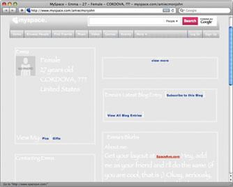
And of course, the best place to find examples of what NOT to do when designing a webpage is on MySpace! Here’s a myspace page that illustrates what happens when you don’t know what contrast is: amiecmonjohn
It can get much worse than this though. How much worse? You don’t want to know… at least, you’ll probably want to turn down your volume or mute your speakers before you discover the glory that is this wonderful cacophony of visual and audial insanity: ukcraigb
But animated GIFs and looping MIDIs aside, would you really want to keep reading something on a site that had serious layout or color problems? I realize those two examples aren’t typical, but they’re great examples of how a website’s appearance can dramatically affect how you process information. (Although that song on the 2nd page is starting to get stuck in my head since I’m letting it play as I write this. I know, perhaps I’m crazy but it actually grows on you.)
In light of how the layout and color balance of a webpage affect how you process the information on this website, I carefully designed this major revision to invite you to be even more comfortable while reading Byteful Travel, as well as to attract new readers. And, as a travel site, it’s important that Byteful Travel’s appearance evoke an adventurous, and even mysterious, feeling when you’re visiting here. And I believe these new changes do just that.
Simplifying Type & The Dangers of a Free Typeface
 Basically, the header really needed a cleaner, more identifiable appearance, and one of the things I did to achieve that was to remove the secondary text that used to be below the words “Byteful Travel”. Now, the header simply reads “Byteful Travel”, and truthfully, that’s all it ever needed. (Fun fact: this is the first time the header has only included 2 words, and no other types of letterforms, since June 2007. That’s a while!)
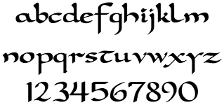
You may also notice that I’m using a completely different, and much more relevant, typeface for the logo in the header now. This lovely typeface is called Carolingia, and the celtic brush style to the letterforms lends an older, and more worldly feel to the header. I’ve also taken the time to manually join some of the letters together, as if they were written by an actual inked pen. (I tried it on two letters and realized it would be unwise of me to stop because it looked so much better. Alas, this is what designers do.)
I fully realize that not everyone is going to notice a subtle detail like that, but it’s in my nature to make everything as polished as it can be (within a reasonable timeframe, of course).
However, since this typeface is available for free at DaFont.com, some designers would suggest that I have treaded into unprofessional waters. In fact, some designers look down on any typefaces offered for free as automatically inferior to their commercial counterparts. This bias within the industry has existed for some time, and perhaps it started out with good reason. (Free typefaces used to be utter crap.) But today there is no excuse for passing up a very polished typeface, even if it’s available freely. At any rate, I don’t mind if designers have a problem with my typeface choice. I’m pleased at how it works within the new logo. And unless they can offer constructive criticism, their words won’t factor into my actions.
Charamandala
You also ought to notice the newly polished Charamandala (the circular logo to the right of the header). In case you’re not up to speed, the Charamandala was introduced as Byteful Travel’s logo in April 2009. (Some wallpapers were even based on it.) It was then completely overhauled in December 2009 in preparation for the complete upgrade and facelift that the site got in January 2010.
Over the weekend, the shape itself wasn’t changed at all, but the Charamandala’s shading and feel of substance has been greatly improved, making it much more visually soothing as well as easier to see from a distance.
So why does this new design work?
In fact, looking at the before and after like is a fantastic way to show off why this new design works. Most obviously, the site has gone from a monochromatic look (i.e., way the heck too much blue), to a duo-chromatic look of cyan and dark indigo. The header text is much more expressive and intriguing; and the background gives the entire site much more depth than it had before. (Not to mention it evokes sands or ocean waves, which both imply far-off lands and travel.)
All of this serves to better visually organize the information on this site. In fact, this is the highest contrasting header I’ve ever created for the site, and it works because it draws the eye’s attention to where it belongs, while at the same time soothing the eye. First the eye goes to the logo text, and then it goes down to the title of the article which flows into the body of an article. It’s like Chicken Voila—it’s magic!
You know, metaphorically speaking…
Acting out of Inspiration
Now here’s the funny part. As I mentioned before, the actions that resulted in this new site-wide design were triggered by inspiration. Instead of chaining my soul to my To Do list, I’ve been paying more and more attention to my feelings and what’s inspiring me in the present moment; and I act on those inspirations whenever I can. You could say I’ve been listening to my heart instead of just my head. Perhaps the inspiration for this… inspiration idea has been Steve Pavlina’s 30 day inspiration trial that I’ve been following for the past week. As he correctly illustrates, when we act out of inspiration, we can create higher quality work; and this work will be much more in tune with our hearts, because true inspiration only comes from a heart-based place.
So this weekend, I felt inspired, and instead of writing down “revise yadda yadda something header project” (in classic GTD style, of course) in my to do list, I decided to sit down and act on the inspiration while it was still hot. And the result was that, not only did I finished these revisions much faster than I anticipated, the finished product was also better than I imagined!
Anyway, I hope you enjoy these changes, and I hope you learned something. I know I did.
