How to Use Yelp to Explore a City (& Avoid Proximity Apathy)


Last week, I returned home from a brief stay in that Magical Land of the North that most people refer to simply, as Canada. And Yelp was my guide.

It was my first time in Toronto, and despite the fact that I only had two and a half days to explore it, I managed to see many of its greatest wonders, including Kensington Market, the Royal Ontario Museum, the Art Gallery of Ontario, the stunning view from the CN Tower, and it’s stunning city hall which was covered in chalk memorializing the late Jack Layton (who had died just a week before I arrived).

So how did I manage to see so many great places in such a short span of time?

How To Utilize a City Efficiently

In the past year, I’ve been utilizing Yelp.com more and more in my exploration of new cities. And if you’re not familiar, Yelp is basically a directory of restaurants, museums, grocery stores, and other useful locations within a city. Think of it as a digital version of the yellow pages, except that Yelp has something yellow pages don’t: user reviews.

Much like reviews for products that you might find on Amazon.com, Yelp’s users review places such as restaurants, parks, and even grocery stores. Locations are also ranked for how expensive they are (by labeling them with one to four dollar signs), and their business hours are also posted. (Well, they’re usually posted. I have come across the occasional business that doesn’t have its business hours listed on Yelp, but a quick Google search usually answers my question.)

And, of course, there’s a free Yelp iOS app.

The practical upshot of this is that, while I’m on the go, I can search for delicious vegetarian restaurants, narrow my search to what’s open for business at that moment (thus filtering out places that are currently closed), get directions to the business, and start heading in the right direction — all using my iPod touch.

If you haven’t used Yelp before, this may sound only marginally better than simply doing a Google maps search, but in practice it’s a much richer (and faster) experience because reviews and business hours are all in one place. It’s so effortless in fact, that I found it quite easy to plan out an entire day just sitting outside an Apple Store and browsing nearby attractions that appealed to me.

Combined with advice I got from my Couchsurfing hosts (who had also lent me a bike that proved supremely useful), I had found the perfect circle of information. One example of this is how I was able to see the Royal Ontario Museum and the Art Gallery of Ontario for free in the same afternoon. One of my Couchsurfing hosts said that they might be free on Wednesday afternoons but that I should check to make sure. After some research, I confirmed that both museums were free and their free hours didn’t even overlap, so I’d have plenty of time to explore both.

An Exquisite Day in Toronto

Savory Crepe from HibiscusAnd so, after having a delicious vegan “savory crepe” at Hibiscus cafe (a delightful place that I suspect I’ll cover in detail in the future), I biked over to the Royal Ontario Museum and proceeded to have a blast exploring its wealth of dinosaurs, pottery, and egyptian artifacts for a few hours. By the time the museum closed at 17.30, I was getting hungry, so I decided to head over to a place that had received some glowing reviews for their vegan cookies and incredible rooibos tea.

Yelp tells the truth, and I thoroughly enjoyed what I can only describe as a “power cookie” with my tea. Even though it wasn’t exactly a full meal, it gave me the energy I needed for the next 4 hours or so. But then again, perhaps I shouldn’t be surprised considering the food was of such high quality (and not that expensive, either).

Now powered by complex carbohydrates, I spent just under an hour wandering through the Art Gallery of Ontario (which was featuring the work of General Idea, at the time), but I left before closing time so I could get photos of the sunset from the top of the CN tower, which was my next destination.

Seeing the sunset from high atop the CN Tower was a fitting end to my explorations of Toronto, and as I looked back on my day from the 114th floor, I thought about how the day had gone incredibly smoothly and how some planning ahead of time, combined with some flexibility, had resulted in one of the best experiences of exploring a city that I had ever had.

How to avoid Proximity Apathy

When I returned home last week, I realized that while Yelp had transformed the way I explore the places I visit, I hadn’t been doing this for my own city. I had practically squeezed the juice out of every opportunity that appealed to me while in Toronto, but I had to admit to myself that I wasn’t doing it at home, where it mattered most.

Why not?

To be completely frank, I’ve actually observed this phenomena for years. Basically, it goes like this: if you live in a city, you will not feel inclined to see anything even remotely “touristy” (even if you may find it otherwise interesting or compelling).

For the purposes of this article, I’m going to call this phenomenon “Proximity Apathy”, because if you have it (and I’ve observed that the majority of people do) you will feel inexplicably uninterested in seeing compelling attractions near you merely because they happen to be nearby… whether you admit it to yourself or not.

Ask yourself, do you believe that you must leave your city to feel as if you’re “stretching yourself” or exploring new territory? That’s a limiting belief, and holding that belief is a choice.

Do you assume, without even visiting them, that otherwise interesting places near you aren’t quite as interesting because they’re so near to you? That, too, is a limiting belief that you can change.

Discover New Worlds… under your nose.

Most recently, I experienced this while on a long distance bike trek. And while the myriad of benefits of using a bike to explore are probably beyond the scope of this article, I must admit that I feel as though I discover entirely new worlds right under my nose when I decide to explore using a bicycle. For instance, this year I learned that there’s a state park that has some truly incredible rock formations just a few miles from where I live. Since it’s a bit off the beaten path, I suspect its attendance is rather low, but that doesn’t mean it isn’t worth seeing (or make an excellent subject for a photo shoot).

We have a tendency to assume that just because we don’t see something, it isn’t there. But have you ever considered that, perhaps, something may not be showing up in your reality because you’ve never consciously gone to seek it out? Have you ever just assumed that what you seek could never be so close? If you have, there’s no reason that it will ever show up in your life. But if you remain open… well.

Let’s just say it truly is amazing what you can find right under your nose, so don’t cheat yourself. Ask yourself: Are you fully taking advantage of what your city has to offer? And if you don’t live in a city per se, what about your immediate surrounding area? Don’t miss out on opportunities just around the corner (often literally!). Use Yelp and other tools and remain open to possibilities. Keep yourself open. When you do, you may just find yourself stepping into an entirely new world that was right beside you the entire time.

How to Post-Process your Travel Photos in 3 Steps (“Selective Color” Secret)


Today I’m going to show you how incredibly powerful post-processing is and why you’d be a raving-mad hatter not to consider post-processing your favorite photos. Post processing is a skill that no traveller with a camera should be without because it has the potential to completely change the language of your photography; especially if you leverage “selective color”, but we’ll get to that.

So what’s the difference between a photo that’s post-processed and one that isn’t?

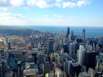
Chicago Skyline to Northeast ORIGINALWell, a few months ago when reviewing inbound links, I noticed that this particular photo was getting 10x more attention than any other photo from my Sears Tower photo shoot.

I hadn’t seen it in years and realized that, knowing what I know now, I could post-process this photo much better than the minimal processing I did when I first published it in late 2008. In fact, it was kind of embarrassing to see just how bad the original photo was, and over a thousand people had already seen it this way! The photo just wasn’t living up to its potential, and I knew I needed to change that.

If you aren’t familiar with the concept of post-processing, it is the process of intelligently improving a photo after it is taken (rather than making adjustments in the camera as you take the photo) so that it becomes a more compelling and effective image. The post-processing technique I’m going to share which you today has evolved over many years of trial and error, but it can summarized into three main steps which I’ve outlined below. To follow these steps, you’ll need a photo editing app such as iPhoto or Picasa. I also address how to utilize more complex applications (such as Photoshop) in step 3, but rest assured the concepts in step 3 can be applied to simpler applications, as well.

Let’s begin!

The 3 Steps to Greatness

  1. Crop with precision
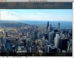
    • CroppingCropping is always the first thing I consider when post processing a photo. Sometimes a crop won’t be necessary, but often a carefully done crop can make or break an image’s composition. In fact, this is an extremely important step because how you frame an image has everything to do with how the image’s content is presented.
    • Try different ratios. Most photos are shot in 4×3 today. Try 3×2. Sometimes I even use 5×3. Most photo editing programs will allow you to set different crop ratios and make it easy to see how a given crop will change the composition even before you apply the crop. (If you aren’t sure what a ratio is, it’s the width of a shape divided by the height.)
    • Be sure to leave some negative space around your main subject. If you don’t, it will result in a photo that feels crowded.
    • Also remember to crop out unnecessarily elements if they distract from your main subject or subjects. If you don’t, you’ll end up with a cluttered image that doesn’t draw the viewer in. But if you crop intelligently, you can create a composition that gracefully leads the eye around your photo.
  2. Fine-Tune the Brightness Curve
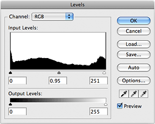
    • Adjusting LevelsAlso known as “adjusting the levels”, fine-tuning the brightness curve of your image is essential. In most apps, the levels will be represented as a histogram which looks like a black mountain range.
    • You may see the black mountain shape disappear before it gets to the edge of one side of the box. This means either the whites aren’t as bright or the darks aren’t as dark as they could be. In iPhoto you can click “Edit” and then “Adjust” to bring up a panel that allows you to control the levels. In Photoshop, choose the “Layer” menu > “New Adjustment Layer” > “Levels” to bring up the levels control.
    • Below this black mountain shape (which represents the brightness curve on the image) are three triangles which control the black, grey, and white levels of the image. Try moving them and seeing how the image changes. To adequately discuss levels would require an article of its own, but just keep in mind that as long as you’re using an adjustment layer in Photoshop, or adjusting the image in iPhoto, you can always change these later without hurting the image.
  3. Color Correct (preferably using Selective Color)
    • Adjusting the color temperature in iPhotoIf you’re using a lighter photo editing app (like iPhoto) and then finishing up in a more complex program like Photoshop, you may want to do a few slight tweaks before you bring the photo into the final app. This isn’t strictly necessary, but it worked out that I adjusted the photo’s temperature balance by 4.1% in iPhoto before bringing it into Photoshop. You can do this in Photoshop, as well; but since I was post-processing dozens of images and not all deserve Photoshop treatment, I sometimes bring images into Photoshop that have already been slightly color-corrected by iPhoto.
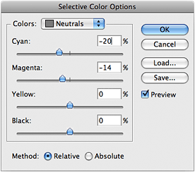
    • Selective color adjustment layer controlsSelective color buttonEver since I discovered “Selective Color” controls, I spend most of my time post-processing in Photoshop because the way a Selective Color adjustment can change your photo is can be truly illuminating. The way you tweak the “Neutrals” is usually the most important since it changes the balance of all the colors in the image. If you have Photoshop, you should also experiment with controls on each specific color because that level of control is often needed to get the blues just right if the photo contains a body of water. This was certainly true for my photo. In Photoshop, you can apply a Selective Color layer by clicking on the black & white circle in the bottom center of the layers palette and choose “Selective Color” in the menu. (It’s the middle button in the picture above.)
    • If you don’t have Photoshop, just whatever color adjustment tools you can find in your app and be sure to try moving all of the sliders, even if you don’t necessarily understand what they do at first. You’ll quickly learn, and there’s no downside. I mean, most likely no one will die from you moving sliders and pushing buttons you don’t understand. 😉
    • Pink Wavey Blooms before and afterLastly, try adjusting the Hue Saturation (also called color saturation). This is usually my last step in post-processing an image. Sometimes an image could use just a bit more color. I rarely go beyond a 10% increase because the realism begins to diminish if you go overboard. In most photo editing apps, you can increase the color saturation very easily. For instance, in iPhoto you can click “Edit” and then “Adjust” to bring up a panel that allows you to control color, levels, and more. In Photoshop, click the same black & white circle mentioned above, and choose “Hue/Saturation”. Also, keep in mind you don’t want to go overboard on saturation, otherwise it can look very fake or cartoony, and that isn’t desirable… unless you’re going for that look. Overall, the color-correction step is like icing on the cake. The photo above is a great example of how intelligent color correction can revitalize an image. Do you see how much more refreshing and vibrant the image is on the right compared to the left side? That’s the power of just one carefully-tuned Selective Color adjustment layer.

Now isn’t that better?

The funny thing about post-processing is that, even though you may be dramatically changing the composition or color balance of the photo, you aren’t necessarily creating an exaggeration of the truth since the camera is never completely accurate in the first place. (In fact, many cameras can be woefully inaccurate in their light metering.) On the contrary, if your goal is to create a greater sense of realism, you can certainly do that better than the camera did… as long as you have a good eye for color. On the other hand, if your goal is something else, perhaps to emphasize a certain shape or a novel way that light interacts with a strange object, you can certainly do that as well.

Chicago Skyline to Northeast ORIGINALLet’s not forget the cluttered, dark, generally icky photo that we started with. The thumbnail here is the unedited original photo, straight from the camera’s eye.

Throughout these post-processing steps, I’ve opted to adjust the photo to create a sense of realism with just the tiniest exaggeration in color, and I must say I’m very pleased with the improvement. It almost seems as though this post-processed version were taken with a wider angle lens, but of course we know it wasn’t. It was merely cropped intelligently so that the greatness in the image could be allowed to reveal itself, not unlike how a piece of marble is chiseled down to reveal a beautiful statue beneath.

What do you think?

Chicago Skyline to Northeast (Trump Tower being built)

Isn’t it amazing what post-processing can do for an image?