All things shall be made new.
Instead of taking you on an adventure to the West Coast, today I’m going to take you on an adventure through color and form. We’re going to discuss powerful perspective changes, breaking tradition, and why being obsessive isn’t always necessarily a bad thing. And on top of all of that, I’ve got a Festivus gift for you: 5 gorgeous desktop wallpapers to get you into the Festivus spirit. But let’s not get ahead of ourselves.
First of all, welcome to the Winter Solstice. There really is nothing like Mid-December, is there? It’s a time when much of North America gets under 9 hours of daylight, and people who thrive on daylight start to get slightly grumpy. 😉
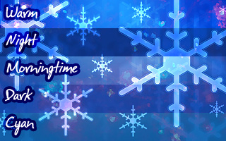
 Tomorrow will be the 7th anniversary of when I first created Snowy Sight, one of my most popular desktop wallpapers ever, and I’m so pleased at how far this piece of art has come since then. In some ways, it’s hard for me to believe that I’ve continued to return to it again and again, refining it for over five years; but I wouldn’t do it if I didn’t enjoy creating it and using it every winter. So today, I’m excited to present to you the new Snowy Cascade wallpaper set, based off of the original Snowy Sight wallpaper from all the way back in 2003. And this year I’m releasing 5 variations (what I like to call “flavors”, which you can see slices of each to the right). It’s my gift to you all, my loyal readers, and I think you’re going to love them.
Isn’t it funny how your perspective changes?
I hadn’t used the Snowy Sight wallpaper in about a year, but once Wisconsin was hit by its first snowstorm a couple weeks ago, I started thinking about it again. I felt the urge to improve it once more.
In a strangely metaphorical way, you might even say that this image is a reflection of myself over the years. As time passes, it becomes more crisp, more honed, and more dynamic. And, like all of my work, it builds on what came before it.
Breakin’ all the Rulz
Traditionally, Snowy Sight has been a shade of blue or indigo, but I really wanted to spice things up this time, so I added new dynamics of color: magentas, violets, and greens. I’d been taking some photographs of Christmas lights the day before, and on whim I decided to drop one of the photos into the Snowy Sight project as a blending layer.
At first, I was intrigued, but I soon realized something wasn’t quite right. Adding the photo added color, but didn’t look right just yet. I needed a way to communicate this new color mix more abstractly.
After experimenting, I realized that my old friend, the crystalline filter, worked really well in this case. Ergo, the crystalline shapes you may be familiar with from Snowy Crystal are back, but they filter from behind the snow flakes this time.
 Originally, perhaps I got a little too passionate about the new color scheme and used a super vibrant version for about a day…
Until I realized that my eyeballs were metaphorically bleeding. It was just too intense for everyday use which is precisely what my wallpapers are intended for, so I did lots of experiments before I found a good balance of subtlety. In practice, this can be a difficult balance to strike because you don’t want a piece of graphic design to be too tiring on the eyes, but you don’t want it to be bland either. However, since this a matter of personal taste, one of the 5 flavors I’m releasing today is pretty colorful, but it’s not too intense either.
Radical Combobulations
Remember when I invented wallpaper mashups three years ago?
If you do, you may recognize this wallpaper as employing that technique. By creatively combining a crystalized photo with the existing smooth shapes of the snow flakes, I drew on techniques from the two previous Snowy Sight wallpapers, and the result is unique and quite pleasing to eyes.
But it wasn’t as easy as you may think.
More Time than You’d Ever Suspect
An inordinate amount of testing went into testing and refining these desktop wallpapers — more time than you’d expect.
Why?
Well, unless you’ve created things like this yourself, you probably don’t realize the amount of tiny details and refinements that must be made before a wallpaper is published. For instance, the new delicate outlines around the flakes had to be meticulously tweaked to look… “right”.
To be brutally honest, you can’t fully appreciate a craft until you do it for yourself, but that’s okay. This is the nature of all art, and nothing to be ashamed of.
However, it is helpful to keep in mind that much more goes into these wallpapers than what can be assumed at first glance. Each wallpaper is tested on multiple displays, and small details and blend modes are refined until they’re just right.
Even Digital Art can be Unforgiving
Much enthusiasm has been generated over the flexibility that artists now have with programs like Photoshop and Lightroom because changes can now be made much more quickly and precisely than with any previous non-digital method. But creating this wallpaper reminded me that even digital art can be unforgiving sometimes.
For instance, when I was nearly done refining this wallpaper set, I noticed that one particular crystal was touching the edge of a flake, creating a small shining line that looked completely out of place. So I had to shift the entire crystalline layer and export all 5 versions again. And this involved manually changing multiple layers to different settings for each flavor of the wallpaper. (And situations like this are not uncommon when refining a piece of graphic design.)
I do it for the Love. Why do you do it?
Maybe I’m crazy to be this particular, but I love creating these images, otherwise I wouldn’t do it. And for me, part of loving it is being obsessive about the small details, because when added together, all of the small details either make or break the whole.
Yes, these details require time and patience to get right, but it’s definitely worth it. Being “obsessive” about something has got a bad reputation in western society. But at the end of the day, being obsessive isn’t always such a bad thing if you’re aware of your own behavior and still able to control yourself; especially if the end result is something enjoyed by many. Which is why today, I’m very pleased to present to you all: Snowy Cascade.
All 5 flavors of this desktop wallpaper (Warm, Morningtime, Dark, Night, and Cyan) are available in Widescreen sizes, in resolutions up to a fantastic 2560×1600 pixels.
I hope they bring you joy and delight you during this holiday season, whatever you celebrate.
Get it in Widescreen (up to 2560×1600) →
All content released under a Creative Commons BY-NC-ND license. These wallpapers will look great up to resolutions of 2560×1600. That’s 4,096,000 pixels of goodness!


